From Transactional to Destination: Reimagining Gratify Café
- Deanna Dunham
- Mar 1
- 2 min read

Branding doesn’t stop at a logo.
It lives in the walls.
In the lighting.
In the way a space guides your eye before you even look at a menu.
When Gratify approached me, they didn’t need a surface update. They needed alignment.
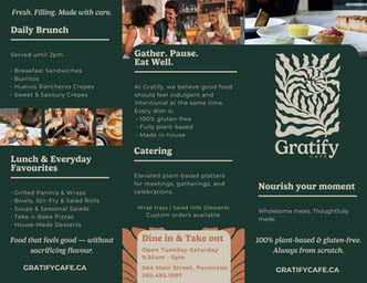
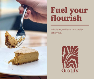
The food was thoughtful — 100% gluten-free, plant-based, made in-house.But the brand experience didn’t yet reflect that level of intention.
So we didn’t just redesign a logo.
We redefined the environment.
The Real Challenge
Gratify had strong products and loyal customers. But visually, the experience felt transactional:
• Frequent coupon-driven promotions
• Inconsistent social media visuals
• Graphics competing for attention• A physical space that lacked cohesion
The quality was there.
The perception wasn’t.
And perception determines value.
Repositioning the Brand
We made a deliberate shift:
From urgency → to invitationFrom discount-driven → to experience-ledFrom crowded → to curated
Visually, that meant building a restrained, grounded identity system:
Deep green as the anchor
Warm neutrals and terracotta accents
Confident serif typography
Controlled promotional language
Structured layouts with breathing room
But the transformation didn’t stop on the page.
Designing the Space
Brand is spatial.
It’s how a room moves you.
We reworked:
Paint direction
Wall color placement
Decor hierarchy
Visual sightlines
Material balance
I spent time walking through how leading lines guide the eye — how a counter edge, a light fixture, or a plant placement can either create flow or visual noise.
We discussed:
• Where the eye lands when someone enters
• What becomes the visual anchor
• How contrast creates focus
• How restraint creates calm
Instead of filling every surface, we curated.
Instead of layering décor, we edited.
Premium spaces are not louder.
They are clearer.
Visual Restraint = Perceived Value
In retail psychology, when everything competes for attention, customers scan.
When visuals are curated and intentional, customers engage.
The same applies to interiors.
The updated Gratify space now reflects:
• Elevated simplicity
• Natural textures
• Grounded tones
• Clear visual hierarchy
• A sense of calm arrival
It feels like a destination — not a transaction.
Building a Brand System (Not Just a Look)
This project included:
• Logo architecture and usage rules
• Defined color systems
• Typography hierarchy
• Photography direction
• Promotional philosophy
• Social media framework
• Interior alignment
• Spatial flow guidance
Every decision pointed back to one core positioning idea:
Grounded ingredients. Elevated simplicity.
Why This Matters
Customers may not consciously articulate spatial flow or brand restraint.
But they feel it.
They feel when a space is calm.
They feel when a brand is confident.
They feel when something is curated with intention.
And that feeling builds trust.
Gratify is no longer positioned as a café that competes on price.
It’s positioned as a place to gather, nourish, and pause.
That shift happens when brand, language, visuals, and environment all speak the same language.
Branding is architecture.
It shapes behavior.
It shapes perception.
It shapes value.
When in doubt, choose restraint.


Comments