Why Colour Consistency Matters More Than You Think (Especially with Green)
- Deanna Dunham
- Apr 8
- 3 min read

I pay more attention to green than any other colour in my work. Not because it’s trendy, but because it’s unforgiving. Even small shifts feel off right away. You might not be able to explain it, but you notice when something doesn’t feel quite right.
Our eyes are especially sensitive to green. We’ve always needed to read it in landscapes, plants, and subtle changes in our surroundings. That instinct doesn’t turn off when someone looks at your brand. If your product has green in it, whether that’s packaging, fabric, labels, or even the environment around it, people are picking up on it without thinking. And they notice inconsistency faster than you’d expect.
Cameras don’t see green the way we do. It shifts depending on light, setting, and how everything is balanced. The same product can look slightly different in every situation. Warmer light can push it yellow, cooler light can pull it blue, mixed lighting can flatten it, and natural greenery can make it feel oversaturated. So even if your product is consistent in real life, it doesn’t always translate that way in photos. When those images sit side by side on your website or social, something feels off. Not in a big way, just enough that it doesn’t quite settle.
That’s where consistency starts to matter. When colour shifts from image to image, it creates a bit of friction. A feed that doesn’t feel cohesive. A product that looks slightly different each time. A brand that doesn’t quite land visually. But when colour holds steady, especially something like green, everything feels more grounded. Your product becomes recognizable. It feels consistent. It starts to feel like itself, no matter where it shows up.
This is something I’ve spent years paying attention to, especially working here in the Okanagan where green is everywhere—vines, landscapes, reflections, labels. I don’t treat colour as something to fix later. I build for it from the beginning by thinking about light before I shoot, balancing the environment, using reference points when needed, and editing in a way that keeps things true rather than overridden.
The goal isn’t to make everything look the same. It’s to make your product feel the same across every image.
That matters more than ever. Your customer might see your product on your website, on social media, in a retailer’s feed, or in an article. If the colour shifts between those spaces, even slightly, it weakens recognition. But when it holds steady, your brand starts to feel established.
This matters even more when you're selling a product. If the colour doesn’t feel right online, people notice. Even if they can’t explain it. And when what arrives doesn’t match what they expected, it creates friction. Returns, hesitation, second-guessing.But when your product looks the same in person as it does in your images, that trust is already there.
That’s what I’m paying attention to when I photograph your work. Not just that it looks good, but that it feels right. That the colour you chose is still there, the way you intended it. People respond to that, even if they can’t name it. Consistency doesn’t just look better. It builds trust.
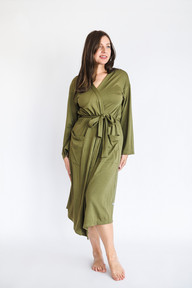
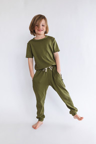
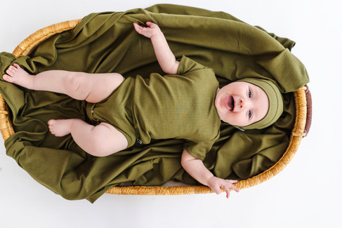
Little & Lively’s olive green is a good example. Photographed for catalogue, campaign, and inside the Little Joys studio. Different light, different spaces, but the tone stays consistent. That’s intentional, because your product should feel like itself wherever it’s seen.
If you're ready to create imagery that holds together across every platform, reach out and let’s plan your shoot.


Comments